Monday 12 December 2011

Music Magazine Photo Images

Since my last post I went home to my  local area and took some pictures for my music magazine that would be suitable and match my ideas. Some photos are involved in a musical activity and some are pictures of a posing person for the contents and double pager article/ interview.

Magazine Front Cover Image
 
The picture of the left is a photo image of a the musician that I am going to interview. As you can see he is in the same standing position as my idea design and has the same props that i have drew: Guitar, Wrist bands and microphone. Plus I have shared my audience research from my questionnaire results (Q.3B). The audience want to see a photo shot of the action and not the person looking at the camera. Using this would attract more attention to the audience once my front cover is completed. Also I went to a concert a month before my taken photos and I took a few photos of the event. Related to music, I'm going to use this as my background for my front cover magazine.
Contents Page Images
Whilst I was taking photos of the main person in the magazine, i also took pictures of a local band that was practising in the same building. With these taken photos I can use them in my contents page to show imagery proof of the named bands that i have mentioned in my text.

Double Page Image
  This photo image is a picture of the interviewed musician doing the same type of pose as my double page idea. Using a high angle shot, makes the musician look at the camera and makes him look smaller, also giving the audience that he is looking up at them and the audience is looking down at him.                                                                                                                                     


Friday 9 December 2011

Music Magazine: Initial Plan and Sketch Ideas For Front Cover, Contents and Double page

Initial Plan
After my collected results from my questionnaire, i used those results and created some ideas for my music magazine pages. Each question results are related to my ideas showing that i have used my research to improve my ideal work. Plus its relates to the theme of my idea, my results match up to a heavy metal type for my idea which would attract an audience suitable enough for a limited age.

Front Cover Idea
My magazine front cover has a heavy metal theme to it using medieval fonts to the master head and Gothic theme to the main person on the front cover "Ryan Mcmannion". Plus all of the text created on this design doesn't cover up the persons face or his instrument. Also, with my previous research on my college magazine i have gave my magazine front over a price tag, date of magazine release and a bar code which is at the bottom of the page. With all the text, fonts and theme put into the design, some shapes and text are in front of one another, so that it makes each shape stand out more, and giving it a 3-D look to it.


Contents Page Idea

The contents page idea design keeps the same theme as it does to my front cover page. Plus using the ideas from my audience research i have done the same text but have moved shapes around, plus using the contents page idea, my text is in columns and not rows, also i have drew 3 images that i could use to improve the ideal design. My colour theme to both my front cover magazine and contents page is going to be a dark and light theme. With my choice and using my research using only 3 colours, I'm going to choose red white and black, which suits the heavy metal look for the magazine.


Double Page Idea

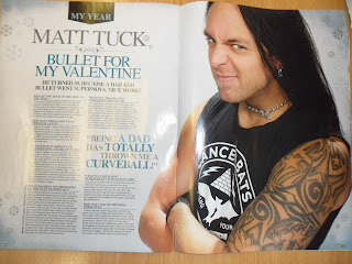
Without my Photos taken for the magazine at this time, i have been looking through some magazines (mostly Kerrang) and comparing double page features/ interviews/ articles on each musician. Over time i have decided that my double page idea is going to look similar to this design because each convention is directed to the audience. The way that Matt tuck looks up at the camera, but as he looks up, its like he looks back at the audience as they read the article. Plus the colour theme of the text on the double page matches the colour theme on the musician and stands out more. Even though my idea will look similar to this, my fonts and colour theme is still going to be the same as my Magazine Front cover and my contents page.